The Village Sign That Tries to Show Everything
A village sign with fewer, clearer motifs can represent local character better, stay legible from the road, and avoid turning a place into a crowded collage.
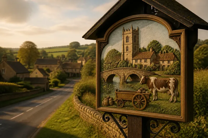
How many symbols should a village sign carry? A village sign usually says more with a few legible motifs than with a miniature inventory of every parish landmark, trade, animal, and annual event. The aim is not to record everything a place contains. It is to give a passerby a readable clue to its character.
Why does a crowded village sign become hard to read?
Because its details compete for attention before any of them can explain the place. A church tower, a farm animal, a stream, a bridge, a historic trade, and a cluster of cottages may all be locally meaningful. Put them together at similar scale and visual weight, and the viewer receives a jumble rather than a clear impression.
A sign is encountered in passing, often from a road or at the edge of a green. Its audience may have only a brief view, and some viewers will be walking or driving rather than standing close enough to inspect the carving. Fine lettering and small decorative scenes are particularly vulnerable to distance, shadow, rain, and the ordinary business of looking at the road.
There is also a difference between a place’s full identity and the handful of things a sign can communicate well. A parish may contain many histories and communities; a panel cannot give each equal space without making every element smaller or making the whole design busier. Compression is part of the job, not a failure of local memory.
Which motifs deserve a place on the sign?
Choose motifs that are both distinctive and easy to recognize. A broad outline of a local bridge may read more clearly than a detailed rendering of its stonework. A simple form associated with a working landscape can carry more character than a row of tiny objects whose meaning depends on a caption.
Start by asking what a person unfamiliar with the village could infer from each proposed image. If the answer is only “people here know why this matters,” the motif may be better suited to a longer account elsewhere. Local knowledge is valuable, but a village sign should not require a committee member standing beside it to translate the picture.
A useful selection test is to ask whether each motif does a distinct job. One may suggest the landscape, another a defining local activity, and a third a recognizable feature of the settlement. If two images communicate nearly the same thing, keeping both may add detail without adding meaning.
- Recognition: Can the motif be understood at a glance?
- Distinctiveness: Does it point to this place rather than to a generic countryside?
- Legibility: Can its main shape survive at the size and viewing distance of the sign?
- Compatibility: Does it sit naturally beside the other selected images?
- Durability of meaning: Is it tied to a lasting feature or practice rather than a short-lived local fashion?
These questions are not a scoring system. They help separate a strong visual cue from an item that matters chiefly because it is familiar to residents.
How can a sign represent more people without adding more pictures?
Representation does not have to mean one symbol for every group, occupation, landmark, or tradition. A sign can be inclusive through the way its chosen motifs are framed, through the wording that accompanies them, and through the process used to choose them. A small set of images can leave room for a fuller story in a nearby notice or local archive.
Ask residents what they think the proposed symbols say about the village, not merely whether they recognize them. Recognition can mask an unintended message. A sign dominated by a grand house, for example, might appear to present one property as the whole settlement, even if the committee selected it because it is visually striking. A less dominant motif or a broader landscape cue may give a more balanced impression.
It also helps to distinguish a symbol’s local association from its visual claim. A mill wheel might refer to a former trade, but it can suggest that milling defines the whole place. If that implication feels too narrow, the design can pair it with a landscape form or another motif that opens the picture rather than adding a row of separate emblems.
What should the lettering and layout do?
The lettering should identify the place first and leave the imagery room to breathe. A clear village name is often more useful than a long motto, a list of dates, or several explanatory captions. Supporting text can provide context, but it should not be asked to repair pictures that are obscure on their own.
Give the main motifs a clear order. One image can lead; another can support it. If every feature is rendered at the same scale and packed into separate compartments, the sign starts to resemble a collection of badges. Open space is not wasted space. It helps distinguish forms and makes the whole panel easier to read.
Consider the sign from the approach a visitor will actually use. A design that looks elegant on a tabletop drawing may become muddy when viewed obliquely, against trees, or beneath a projecting roof. A plain paper mock-up at roughly the intended proportions can reveal whether the name and principal forms remain distinct without elaborate shading or small decorative lines.
Color can help separate elements, but it should not carry the entire burden of recognition. Strong outlines and clear spacing are more dependable when colors weather, darken, or blend with the setting. The sign should still make sense as a simple silhouette.
How should a committee settle disagreements about symbols?
Make the choice about communication rather than the relative importance of residents’ memories. If a group begins by asking whose history deserves a place, the design can become a contest in which every omission feels like a judgment. Begin instead with the intended reading: what should someone understand about the village after a brief glance?
Then compare candidate motifs in the same simple format. Draw each as a plain outline, with no decorative finish, and place it beside the village name. Ask whether it remains recognizable at a small size, whether it duplicates another motif, and whether it gives a misleading impression of the place. This keeps the discussion anchored in what the sign can communicate, not in which image has the most elaborate backstory.
Say a village committee is choosing among a river bend, a church tower, a market cart, a rare bird, and a cluster of cottages. If the committee’s aim is to convey the settlement’s setting and its continuing role as a local meeting place, it might retain the river bend and a simplified market cart, then leave the tower and bird to a separate interpretive panel. The expected result is a sign with two recognizable cues and enough open space for its name to stand out, while the omitted stories remain available in a format that can explain them.
It is not worth the effort to encode every local reference in tiny carving, color changes, or a row of symbols that only residents can decode. Those details demand close inspection and usually make the central message less immediate. A separate plaque, walking map, or community display can handle the longer account more kindly.
What questions do people ask before approving a village sign?
Should a village sign include the parish church?
Include it if its form is distinctive and it helps explain the village, not simply because it is familiar. A simplified tower or roofline may be clearer than a detailed church scene.
Can a sign show several local trades?
It can, but a row of tools may read as a catalogue rather than a portrait of the place. Select the trade or object that best conveys the village’s character, and use a larger display for the rest.
Does a simpler design risk looking generic?
It can if its motifs are interchangeable with those of any nearby village. Distinctiveness comes from choosing a form, setting, or activity with a specific local association, then drawing it in a recognizable way.
Where should the stories behind omitted symbols go?
A local history display, trail leaflet, noticeboard, or online parish page can hold details that cannot be read on a roadside panel. The sign can point toward that deeper account without trying to contain it.
When is a village sign ready to approve?
Approve the design when its name and main motifs can be understood without a spoken explanation, and when residents can describe what the sign communicates in broadly similar terms. Some disagreement is inevitable; the test is not unanimous affection for every image, but a shared grasp of the overall message.
Review a plain, full-size drawing from the expected viewing position and ask someone unfamiliar with the design what they notice first. If they see the village name and identify the principal image, the hierarchy is doing its work. If they instead report a small border detail or cannot tell one motif from another, simplify the drawing before adding polish.
Material, fixing, and maintenance choices affect how the finished sign holds up, and those decisions should be considered alongside the design. Follow the sign maker’s specifications and any relevant local requirements rather than assuming that a suitable image alone makes the installation suitable.
A good village sign is not a compressed history book. It is a clear invitation to notice a place. Keep the village sign focused on the few images that best express its setting and character, and give the rest of its stories room to be told where people can stop and read them.